Once a theme is opened in the editor, admins can changing the settings for the various components of a theme.
- General - sets the standard font and color palette to be used throughout the theme
- Grid - these are settings uniquely set for the grid visual determining how it will look and feel: columns, rows and data cells.
- Visuals - these settings govern all other visuals, covering titles, axes, grid lines, legends and range colors
- Text - these settings govern the way text elements in the app can be styled. Text elements are text boxes added in Present, Publish and Illustrate. It also includes the panel text designs in the Present app.
- Masters - these settings allow the governance of the main design(or "masters") for Present dashboards and Publish report templates,
Style Inheritance
By choosing the inheritance option for settings (where available), the parent settings will be applied. This makes it easier to create consistent styles that cascade through the style template from the top to the bottom. Inherited settings flow from the general element from each section. And the general element from each section cascades from the of the theme.
Custom Fonts
Admins can import custom fonts into the platform, to be used in theme templates and for user to change the way text appears throughout the application.
Theme Setting Guide
|
General |
|
|
Font |
Set the theme default font type. |
|
Font Size |
Set the default font size. |
|
Font Style |
Set the default font style. |
|
Font Weight |
Set the default font weigh (bold, normal) |
|
Font Color |
Set the default font color. |
|
Background Color |
Set the default canvas color. |
|
Line Color |
Set the default line or stroke color. |
|
Report Colors |
Set the default colors for data in the visualizations, in the desired order. For instance, in a bar chart, Report Color #1 corresponds to the first bar, Report Color #2 corresponds to the second bar, and so on. In a grid, Report Color #1 corresponds to the grid column headers, while Report Color #2 will serve as the default color for grid row headers. |
|
Grid |
Set visual preferences for grids. |
|
General |
Set the font type, size, style, weight, and color, as well as the canvas color. To use the preference that were set under General (above), select 'inherit.' |
|
Columns |
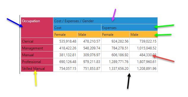
Sets styling of the column layer in a matrix or tabular grid. (green arrows below) |
|
Column Header |
Sets styling of the column headers in a matrix grid. (purple arrow below) |
|
Rows |
Sets styling of the row layer in a matrix or tabular grid. (yellow arrow below) |
|
Row Header |
Sets styling of the row headers in a matrix grid. (blue arrow below) |
|
Data |
Font, padding, alignment, and background color preferences for cells in a matrix grid (red arrow below) |
|
Border |
Width and color of the cell lines of the grid. (black arrow below) |
|
Color Mapping |
Sets the mechanism for how to automatically apply the general colors to the columns and rows of a matrix grid. With independent settings for the colors of a tabular grid. |

|
Visuals |
Set visual preferences for all other visuals (except grids). |
|
General |
Set the font type, size, style, weight, and color, as well as the canvas color. To use the preference that were set under General (above), select 'inherit.' |
|
Report Title |
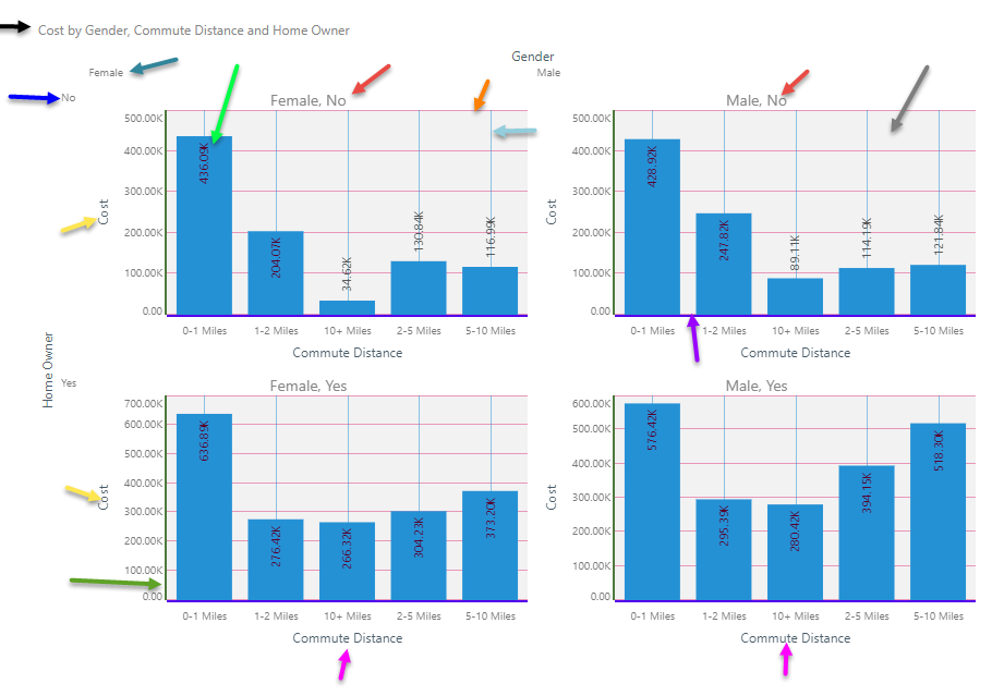
Font preferences for the report title. (black arrow below) |
|
Multi Chart Title |
Font and alignment preferences for trellis chart titles. (red arrows below) |
|
Legend |
Font, position, and line preferences for legends and legend titles. |
|
X-Trellis Axis |
Font preferences for the x-trellis axis in multi charts. (teal arrow below) |
|
X-Axis |
Font and line preferences for the x-axis for a given chart (purple arrow below) |
|
X-Axis Title |
Font and line preferences for the x-axis title. (fuchsia arrow below) |
|
Y-Trellis Axis |
Font preferences for the y-trellis axis in multi charts. (blue arrow below) |
|
Y-Axis |
Font and line preferences for the y-axis for a given chart (green arrow below) |
|
Y-Axis Title |
Font and line preferences for the y-axis title. (yellow arrow below) |
|
Data Labels |
Font and background preferences for data labels. (light green arrow below) |
|
Plot Area |
Set the background color for the plotting area, as well as the line width and color. (gray arrow below) |
|
Cartesian Style |
Set the opacity setting. (0= transparent, 1=opaque) |
|
X-Grid Lines |
Set the line color and width for x-axis grid lines (vertical) (orange arrow below) |
|
Y-Grid Lines |
Set the line color and width for y-axis grid lines (horizontal) (light blue arrow below) |
|
Data Points |
Set the default outline thickness for data points (for line, area, point, scatter and bubble) |
|
Range Colors |
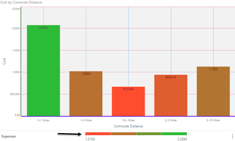
Sets the default 3 color bands (and opacities) for KPI's, gauges and continuous legends. The "target" and "Actual" colors are used for bullets Gauges. |

Range colors can be seen below:

|
Text Style |
Set visual preferences for text objects. |
|
General |
Set the font type, size, style, weight, and color for the MAIN text style. |
|
Heading 1 |
Font preferences for the main header style. |
|
Heading 2 |
Font preferences for the secondary header style. |
|
Heading 3 |
Font preferences for the tertiary header style. |
|
Heading 4 |
Font preferences for the last header style. |
|
Panel Heading |
Font preferences for the Panel header in Present and Publish (red arrow below) |
|
Panel Breadcrumbs |
Font preferences for the Panel breadcrumbs in Present and Publish (green arrow below) |
Master Pages in Themes
Each theme can include full page designs for Present dashboards and Publish reports using master pages. Existing master pages can be attached to a given theme, which will then become the default master page design deployed when that theme is used. For more, click here.
